SLUG Photography Issue
SLUG PHOTOGRAPHY ISSUE
Context • Design Problem • Constraints
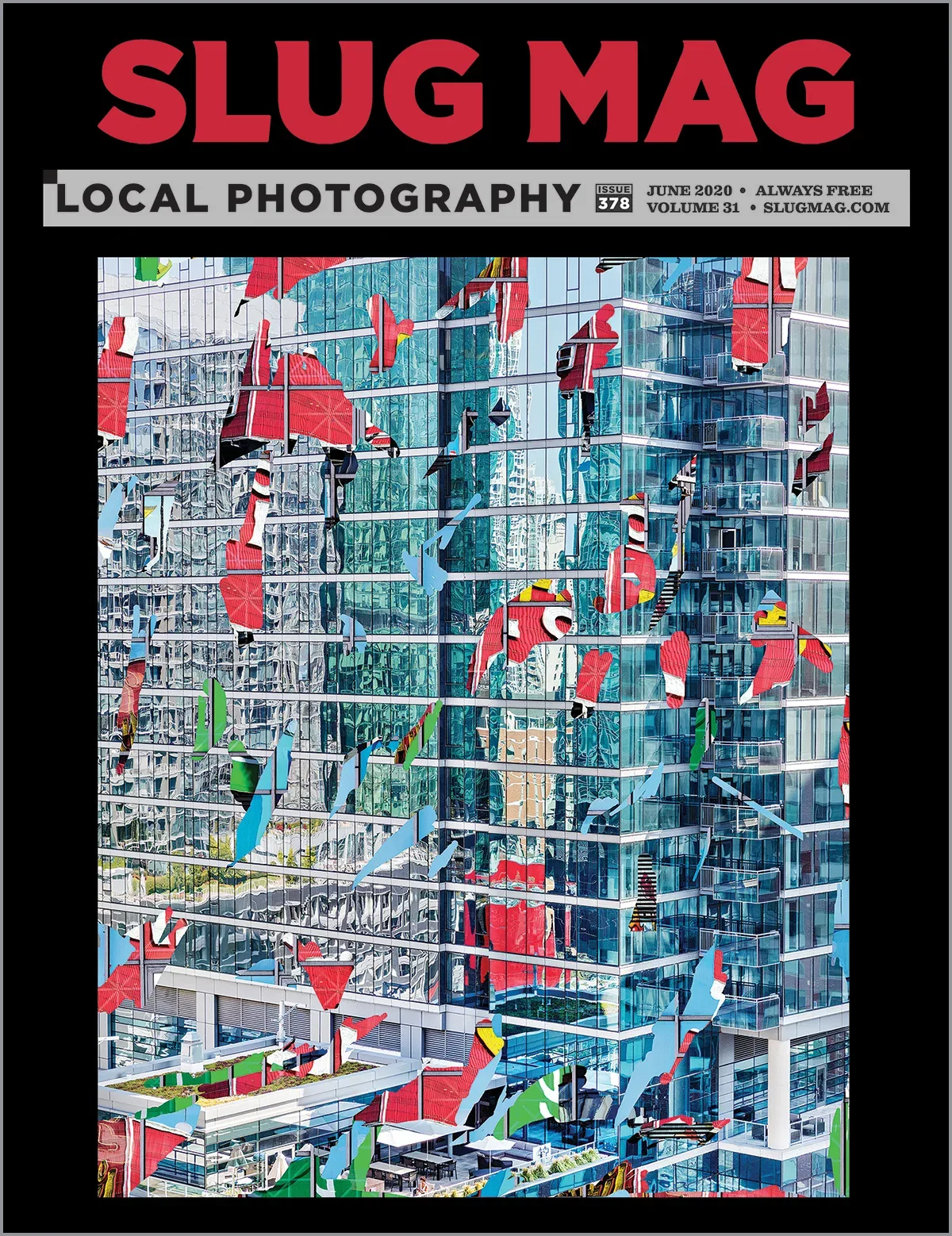
Showcase local photographers’ range of photography disciplines throughout the entire photo-centered issue. Each photographer should be spotlighted while ensuring the collection of photographers all feel connected throughout the entire issue. Highlight the photos over all other text and items on each page.
The photography issue differs from all other SLUG issues by allowing the curated photos to tell each photographer’s story, giving body text a break for the month. We all know how much a powerful photo is worth in words.
It’s important that all the photos from the local community of photographers are brought to light over everything else. SLUG asks the readers to slow down and focus on one or a few images at a time instead of an infinite scrolling album.
Wireframes & UI Kit
My Role in the Project
Conceptualizing and organizing a visual system that illuminates each photographer’s series of photos as an individual while ensuring all artists feel part of the whole.
Created mockups and wireframes for the issue design system.
Choose the fonts used.
Helped select photo content based on the written part of the photographer’s story profile.
Implemented the system and placed all of the photos and text, including the story title, captions, and body copy.
Ensured all the photos were printed with the best quality possible.
Solution
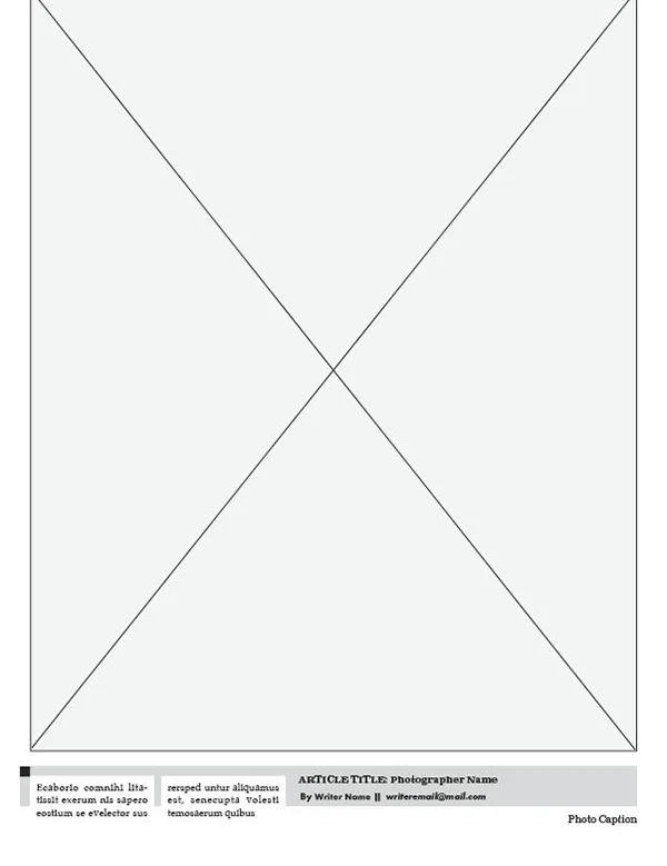
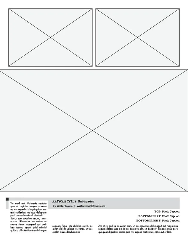
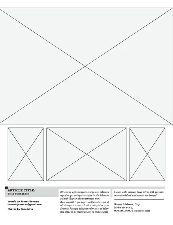
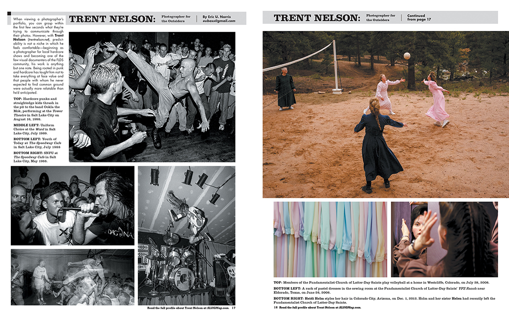
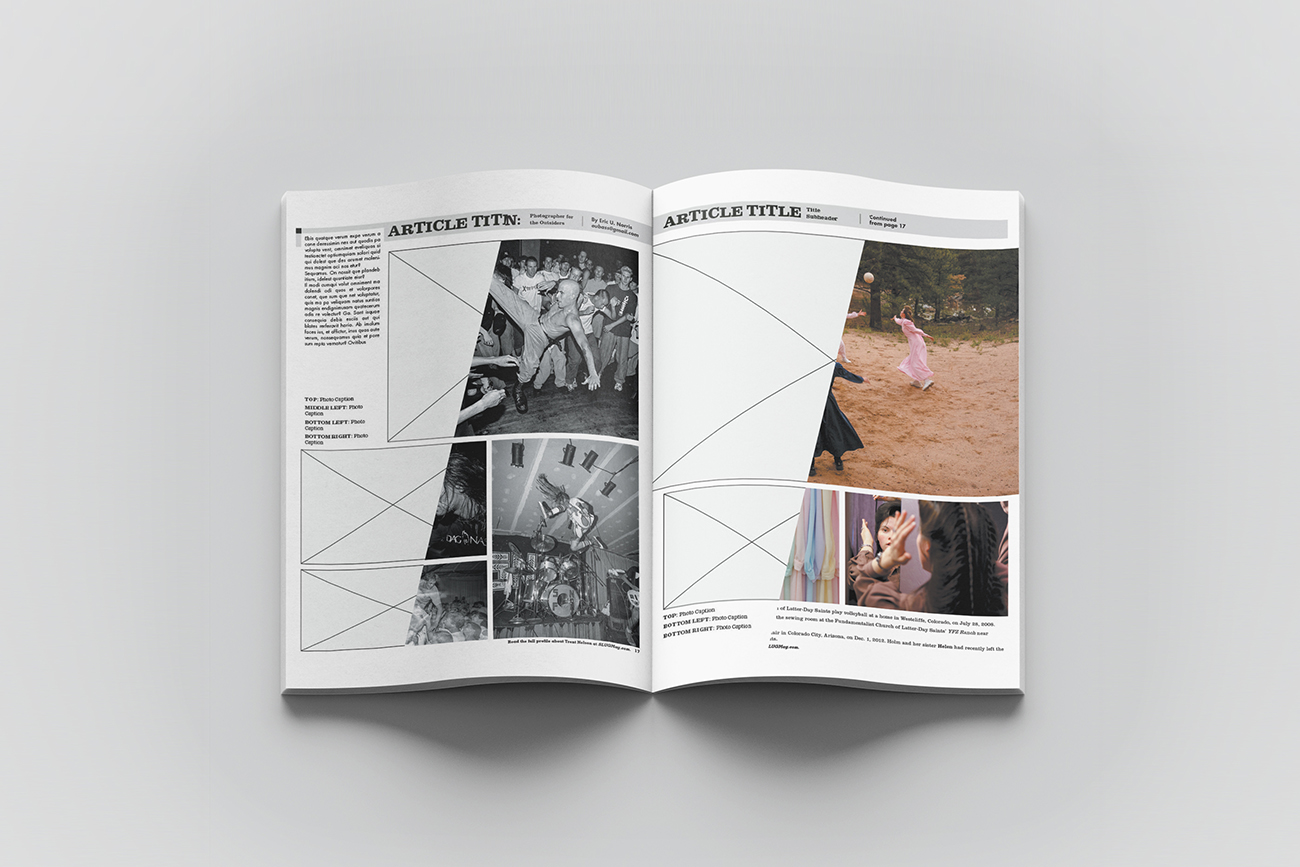
By drastically cutting down the normal amount of text seen in the magazine and making an artist’s photo as large as possible, the main focal point of each editorial page is given to the photo over text. Moving the title and all text to the bottom of the page forces readers to focus on the images. Certain types of work, such as commercial and fine art, provided one strong photo per story, allowing the viewer to discover a photographer’s talent through the use of light and detail. Others were allowed three or more photos to help build a narrative for the viewer and lean into a documentary style of work. Keeping most of the editorial page elements constrained to simple shapes and light tones such as 18% gray and white helped create consistency from page to page.
Project Key Learnings
No matter how well a design system is constructed, there will be instances where elements in the system don’t entirely fit as intended. Allowing the system to loosen up on some of the unforeseen design elements when presented helps the system to evolve and expand. The system should keep the majority of its visual structure for all elements, or the system breaks. When faced with placing artist photos across a two-page spread, the design system had to evolve by moving the title and text information around to adapt for the larger photo and subsequent photos.
Conclusion
Creating a photo issue design system goes beyond design in the normal sense. Most of the basic elements, such as shape, line, typography, and color, all form into the visual outcome per page. The page layout system dives deep into a refined way of design by building an expanding visual communication system made to hold somewhat unexpected parameters, such as varying text length and one or more photographs of various sizes.
Creating the photo issue design system gave way to a better understanding of what design is truly about by viewing design through a larger aperture.