SLUG MAGAZINE WEBSITE
SLUG MAGAZINE WEBSITE
SLUG Magazine’s site produces local, marginalized content, reviews, and event coverage. The content is first presented in Salt Lake City and the surrounding areas, and ultimately to the whole world as a free print and online publication.
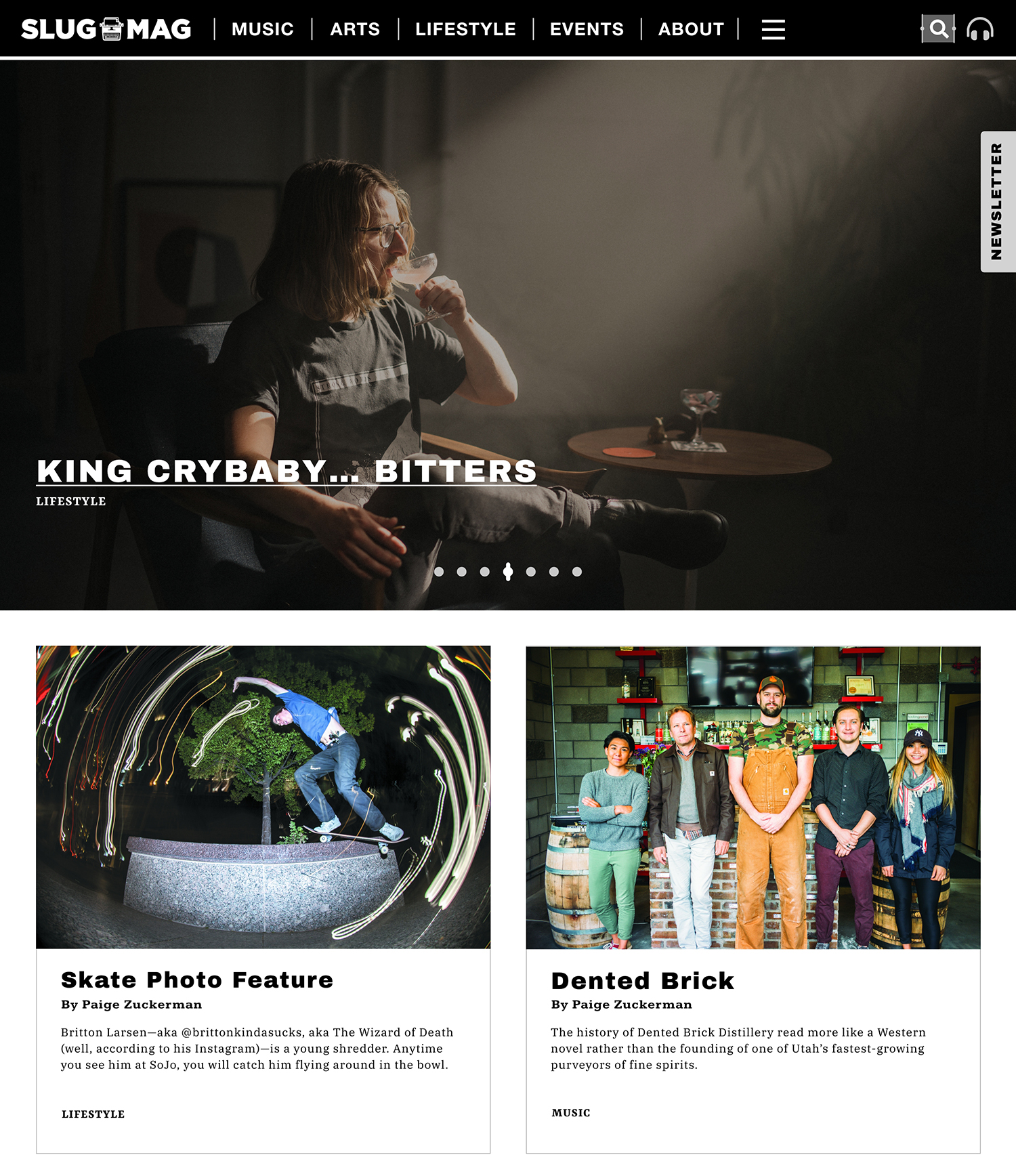
Context • Design Problem • Constraints
The vast amount of content on SLUG Magazine’s website goes back to 1989. According to reader feedback, sifting through the large amount of content on the old site made it hard to find the sought-after information. The outlined structure of topics in the drop down navigation menu couldn’t properly direct users to an article they where seeking. The landing page displayed too much information without enough white space. The curation of the site’s newer content added every month and older content became too intertwined, camouflaging many recent stories, reviews, and photo galleries from readers. Because the original website was built using WordPress with many other custom scripts, the new site required the same WordPress foundation to build from.
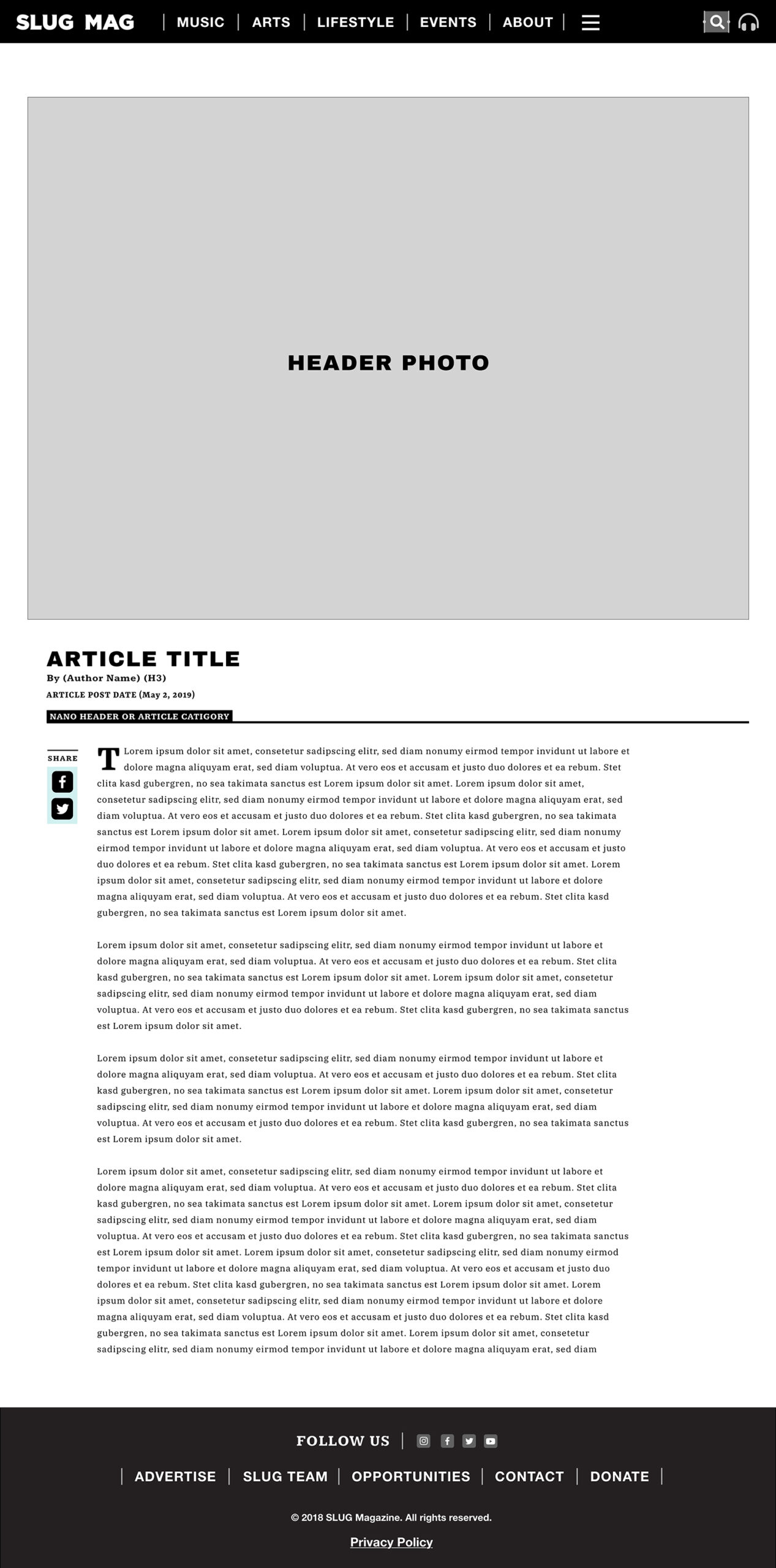
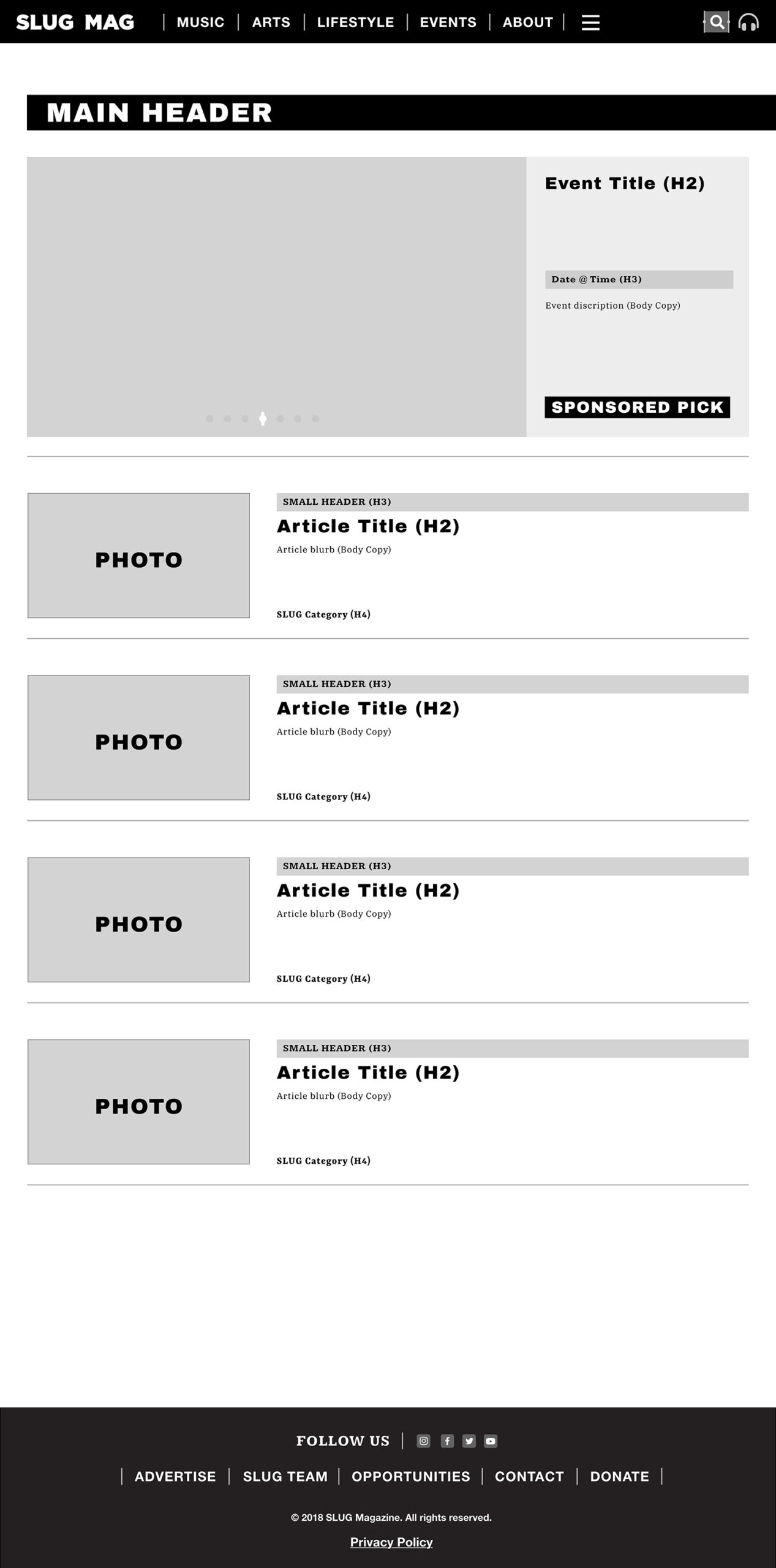
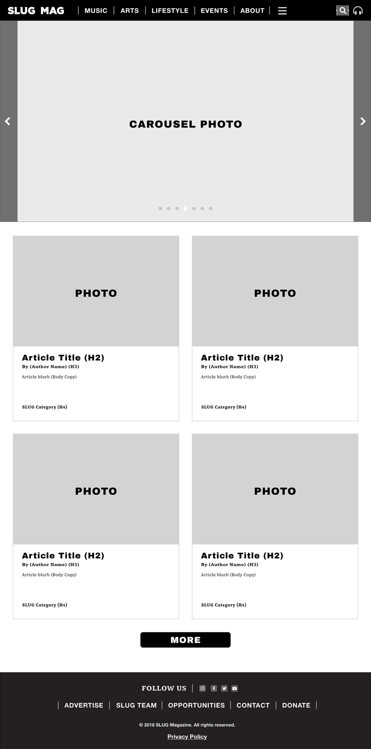
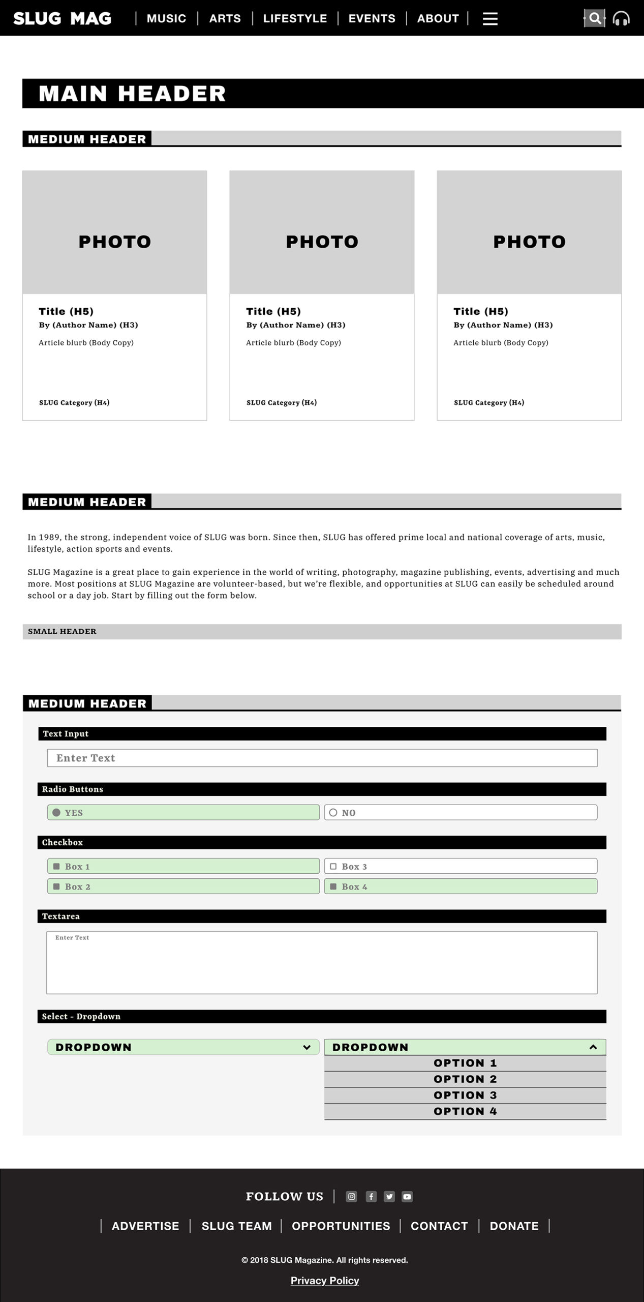
Wireframes & UI Kit
My Role in the Project
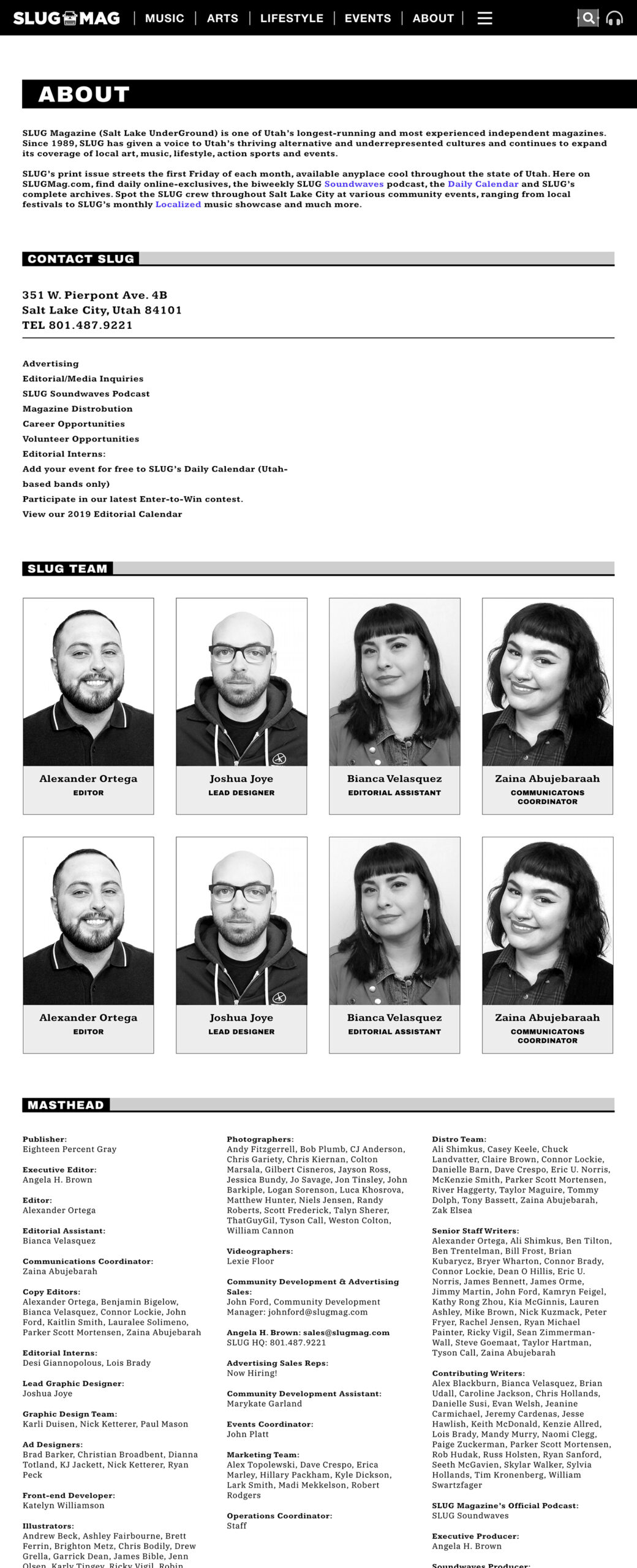
Reorganize Salt Lake UnderGround’s template posts, pages, events, and photo galleries categories to help users better understand how the site is organized and find intended information. Construct a larger submenu for specific coverage by SLUG along with information about the organization. Rebuild the visual interface for the entire website from the bottom up. Design page layouts with visual elements for highlighting new content by giving intuitive cues to help discern and interact separate from aged content. Create a design system to reflect how the site pages and its elements, such as forms, buttons, headlines, and text, should look and function for the entire website’s current state and into the future.
Solution
Reorganized SaltLakeUnderGround’s template posts, pages, events, and photo galleries categories to help a person better understand how the site is organized and find intended information. Constructed a larger sub-menu for specific coverage by SLUG along with information about the organization. Rebuilt the visual interface for the entire website from the bottom up. Designed page layouts with elements for heightening new content by giving visual cues to help discern and interact with apart from aged content. Created a design template system to reflect how the site pages and its elements such as forms, buttons, headlines, and text should look and function for the entire website’s current and future elements.
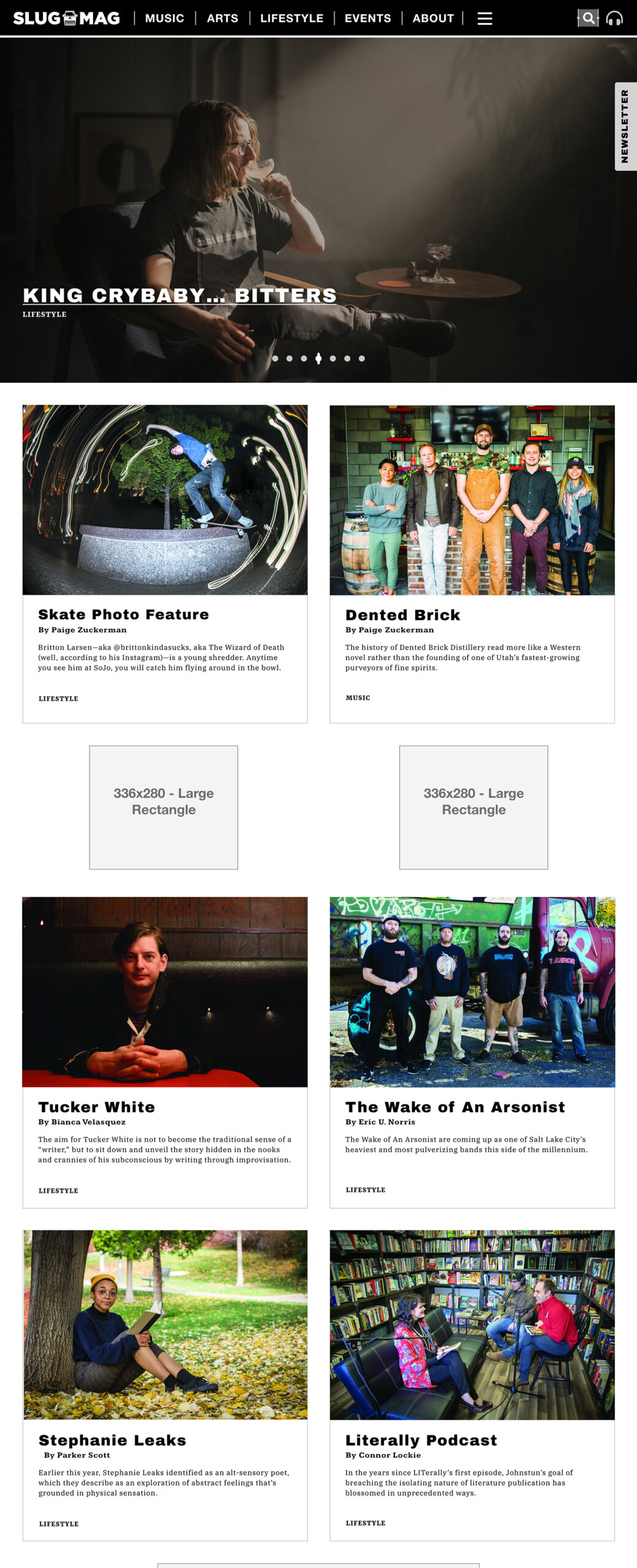
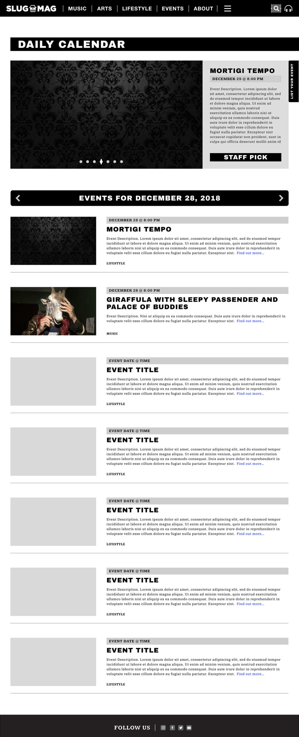
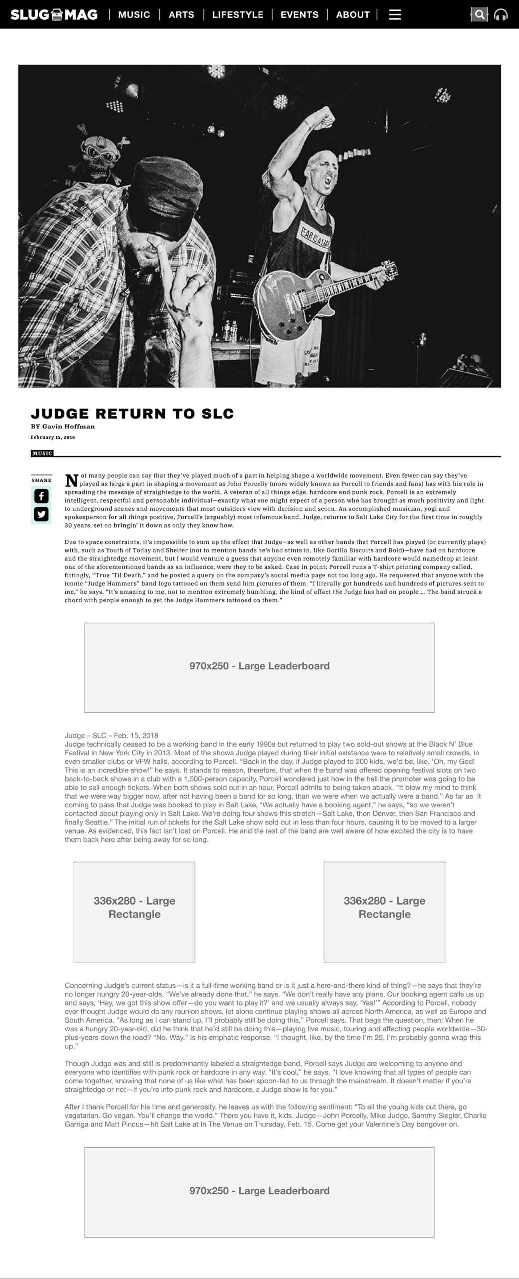
Project Key Learnings
It’s easy to lose sight of the original outlined goals created at the beginning of a huge website redesign project as time progresses during the research and planning phases. It’s important to record and keep a solid reference to the original goals over the project duration. Excitement over new ideas and features can lead any team to stray far outside the core problems to solve with any website.
Conclusion
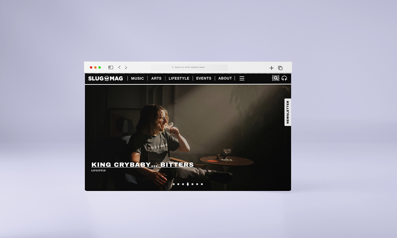
SLUG Magazine’s website interface and functionality revolve around a community of readers. This site called for a deep sensibility of how the vast amount of content can be quickly sifted through to find a piece of lesser-known history, reviews of all types, and local content. Seeing new content and events runs parallel to the importance of archived content. The delicate balance of both types of content forged a carefully thought-out landing page for exhibiting the new with concise routes to older content. Due to the broad amount of information, the site exhibited a tedious and large amount of thought enacting a redesign to handle all current and future content. The large amount of time taken to update the site reflects the interface and design of the new slugmag.com.